Are volcano plots really the best tool to understand your data?
You cannot hide from volcano plots in the proteomics world. Log2 fold change on the x-axis, negative log10 p-value on the y-axis, a comforting symmetrical shape, and the interesting points politely arranging themselves in the top-left and top-right corners. Add a couple of dashed lines, a colour gradient, and a handful of gene labels, and the chart practically narrates itself.
After more than three years building statistical pipelines and data analysis apps for proteomics-led discovery teams, I have come to a contrarian view: the volcano plot is doing less work for the analyst than it appears to. The shape is comforting precisely because it has been disconnected from the questions the analyst actually wants to ask.
What the volcano plot is good at
It is fair to start with the case for the defence. As a diagnostic, the volcano plot has its place. It shows, at a glance, whether a comparison produced a plausible distribution of effects, whether the fold-change axis is roughly symmetric, whether the p-value distribution is approximately what you would expect under the null in the bulk of points. It is a useful sanity check.
That is a narrow use. The trouble starts when the same chart becomes the canonical interpretation tool — the figure that appears on the slide where the team decides what to follow up on, what to put into validation, what to write up in the paper.
Three problems for interpretation
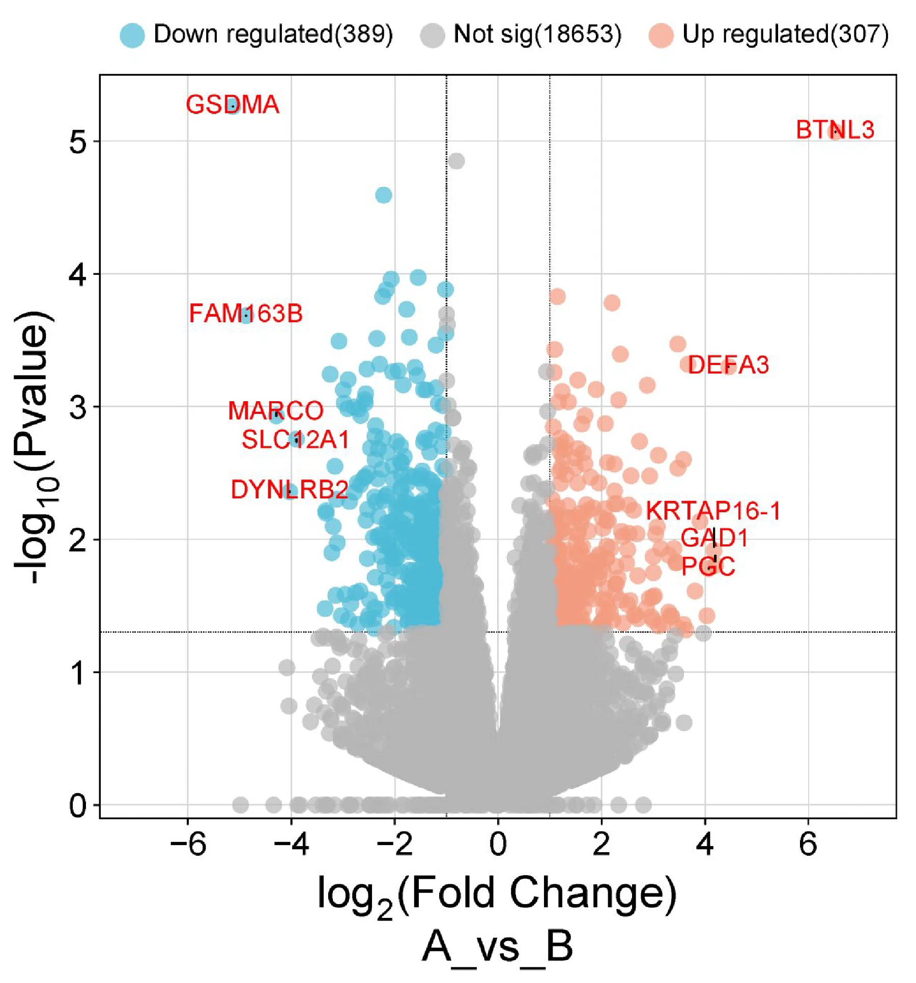
Too many points to care about. A typical volcano plot in our work shows nineteen thousand grey dots. Nobody is going to read them. The grey mass exists to flatter the few coloured points by giving them a backdrop, but it pulls the eye away from the questions that actually matter for the next experiment. We are routinely showing the analyst 99% data they will never look at.
No structure beyond significance. The position of a point on the volcano plot tells you how big the effect is and how confident the test is — and nothing else. The plot has no axis for the questions a discovery team actually has: which subcellular compartment is the protein in, which pathway does it belong to, was it detected in the orthogonal assay, is the result consistent across replicates and batches, is the signal driven by a single peptide. None of that information is in the chart, so none of it is in the conversation the chart is anchoring.
P-values get too much real estate. This one comes from the statistician in me. Past a certain threshold, the practical difference between an FDR-corrected p-value of 0.0001 and 0.00001 is essentially nothing for downstream decisions: both indicate that the effect is unlikely to be noise, and the choice between candidates should come from biology, not from the third decimal of a transformed p-value. A log-scaled y-axis devoted entirely to that single number gives it a disproportionate share of the figure — and, in practice, of the discussion.
What to plot instead
I do not have a single replacement chart, and I am suspicious of anyone who claims to. The point is not to swap one canonical plot for another but to leave the idea of a canonical plot behind. A useful starting routine:
Filter first, plot second. The dashed lines on the volcano plot are an admission that the points outside them are not going to be discussed. Apply the filter explicitly — by fold change, by adjusted p-value, by detection in both groups, by whatever cutoff the team has actually agreed on — and only then plot. The plot now contains a hundred points the team will look at, not nineteen thousand they will not.
Add an axis that encodes something biologically useful. With the irrelevant points gone, the y-axis is free. Use it for something the team needs in order to decide: mean intensity across samples, replicate consistency, signal from a paired transcriptomics or chemoproteomics readout, presence in a curated target list. Fold change on the x-axis stays — it is what makes the comparison a comparison.
Bring complementary information into the same view. A discovery team almost never has only one assay. Annotate the points with pathway membership, compartment, druggability score, prior literature evidence — whatever signals you have. The interesting candidates are usually the ones where two independent lines of evidence agree.
Iterate; let intuition lead. Plots are cheap. The team that knows the biology should be turning out three or four variations in an afternoon and keeping the one that surfaces the real disagreements. The right plot for a given experiment is rarely the right plot for the next one.
None of this is novel as statistics. It is novel only relative to a discipline that has standardised on a chart designed for the wrong job.
Why this matters
We work on pipelines that take proteomics data from raw instrument output to decision-ready artefacts for scientists and platform teams. The visualisation layer is the place where everything earlier in the pipeline — the QC, the normalisation, the statistical model — has to earn its keep by helping someone make a better choice. A chart that hides four out of every five questions the team would otherwise ask is a chart that is leaving value on the table.
So this is an honest invitation, not a closing argument. Are you using volcano plots because they tell you what you need, or because the field has trained everyone to expect them? What does your decision-ready chart look like? I would like to compare notes — drop me a line.